Saturday, October 15, 2022

"He couldn't look handsomer, I couldn't feel humbler, we couldn't be happier"

Wicked The Musical Broadway illustration Glinda Upland Fiyero Tiggular Tigelaar

Almost a year since I last updated, huh?


In truth I got The Big Sad and didn't much feel like drawing, but I truly feel like I'm out of it. I've had phases like this before where I think I'm feeling better only for it to come crashing down around me, but this is just feels different somehow. Like I'm not trying to force anything or go through any motions, I'm just lighter and more engaged again. I feel like the old me, and it's wonderful. And I've slowly felt like drawing again, for myself without pressure, and this is the first thing I've felt like sharing.


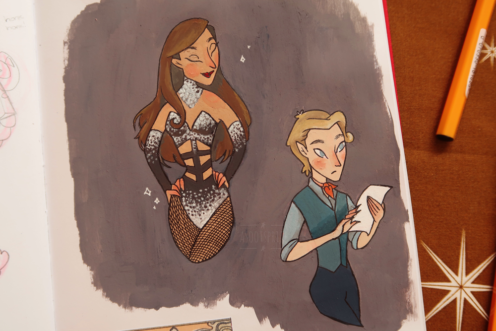
Earlier this month Wicked shared a publicity shot on Twitter of Brittney Johnson and Sam Gravitte as Glinda and Fiyero respectively and something about their posing made me instantly want to draw it. I also really got into fountain pens this past year, and originally painted this with layers of inks in the colors Blushing Mushroom and Adventurine by Ferris Wheel Press. It's my first time trying to incorporate inks like this, and I'm having fun with it and enjoy the texture. I ended up going over the inks with a light brush of colored pencil just as it lacked definition. Hopefully if I keep practicing I won't have to do that, but also this probably wasn't the best image to practice that method with as areas are too small and detailed. The inks are shimmery though, which left a neat effect!


Although this is based on an image featuring Brittany Johnson, I've drawn my own design of the characters as I always do. I am not whitewashing Glinda, she is white in the book which is integral to Fiyero's character development as the only person of color in Shiz. As I've written about before I prefer to keep the characters as a combination of their musical and novel selves as it adds more depth and I love them both. I just wanted to take a moment to explain so no one misconstrues my intentions! I'm by no means trying to diminish Brittany's acomplishment as the first Black Glinda on Broadway, which is about damn time. Casting should always be colorblind.


This isn't the best thing I've drawn, but I'm just happy to be drawing again. Perhaps I'll share some of the earlier things in this sketchbook, but I also have a lot of ideas for the future. I can't say when as I have a lot going on right now, but know it's coming.

Wednesday, September 15, 2021

Washi tape

I designed a washi tape! To be honest I wasn't sure whether to save posting this until I can show the finished manufactured product, but I worked too long and too hard on it and want to shout about it as much as I can.


As I was wrapping some parcels for my shop I thought how fun and 'on brand' it would be if I had my own washi tape I could use to secure everything (I currently use a generic patterned one I bought in Japan). I knew it would involve creating a long, run on image, and I immediately thought of my Folktale Week drawings, which to this day are still some of my favorite illustrations I've ever created (all of my work from 2018/2019 is to be honest, I feel like that was when I peaked 😭) As much as I love that artwork, it doesn't all make sense because it was following a prompt list, so I decided to create a new version and this time really commit to the theme of Russian folktales instead of just being inspired by the general aesthetic.


There's not a huge amount of characters, partly because I wanted to keep it identifiable to a global audience so didn't want to go for anything too obscure, and I didn't want it to look too crowded, it's mostly just supposed to be a forest with a few magical elements.


Obviously I had to include Baba Yaga and her hut, which is probably the most iconic character to people from around the world, and I also included the Firebird which crops up in a few different Slavic tales. And a bear, because it's the Russian forest, and they do crop up in folktales (plus I just love bears OK)


Now I just hope it comes out OK! I put a lot of detail in and I hope it isn't too pointless for such a small product. It'll eventually be sold in a set with another tape, and I'll be sure to update when it's ready!

Angel of Music

I hadn't even thought about The Phantom of the Opera in years when I suddenly had the urge from nowhere to draw this. I listened to the soundtrack as I drew it, decided to book a ticket and go see it for old times sake, and it's kind of all snowballed from there.

Tuesday, May 11, 2021

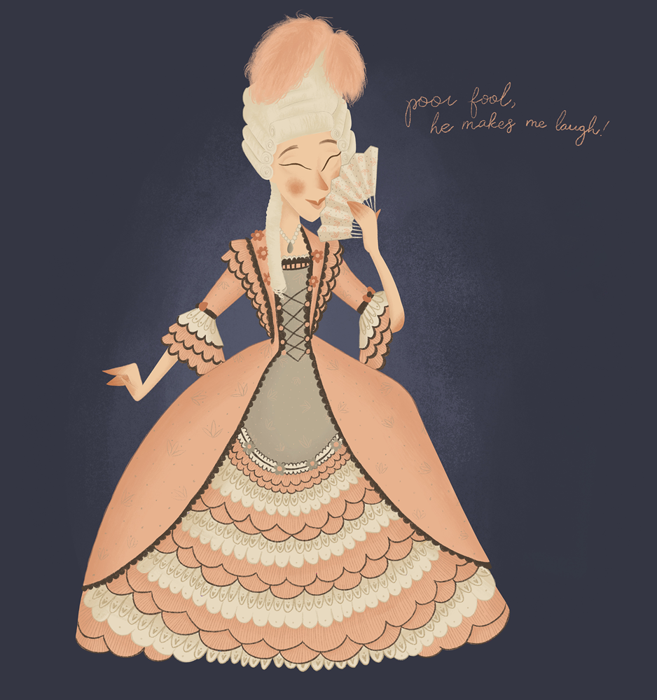
Poor fool, he makes me laugh!

Carlotta Giudicelli The Phantom of the Opera

Carlotta Giudicelli from The Phantom of the Opera.


The Phantom of the Opera was my OG musical obsession and is really what got me interested in musical theatre and going regularly, and was what lead me onto discovering other productions as I followed my favourite actors careers after they moved on from the roles. So I have a lot to thank it for! I haven't paid it much attention for a while, but I gave the 25th Anniversary concert a listen a few weeks ago and have been on a bit of a Phantom kick ever since. I really want to re-read the book again this year!


Carlotta has always been one of my favourite characters, and it always saddens me how much she's overlooked or dismissed as nothing but a 'diva' and pitted against Christine. Carlotta is quite a lot older than 16 year old Christine - she's probably in her 30s or 40s and would have dedicated her life to working damn hard to win the role of lead soprano at one of the biggest opera house's in Paris. And like so often happens to women in the entertainment industry, her hard work and dedication to her craft is being overlooked as she's passed over for a younger actress who, as far as Carlotta is concerned, hasn't had any proper vocal training nor worked her way up through the lower ranks and gained that experience. And if that isn't insulting enough, she then has her performance sabotaged in front of a full house which would have impacted her reputation. She's a tragic character! Her throwing a few bitchy comments Christine's way doesn't make her a bad person when you consider everything she's being put through, her upset is valid!


I also love her relationship with Piangi. As much as I love Phantom of the Opera, the two main relationships of Christine and Raoul and Christine and the Phantom are BOTH toxic as hell, and then in the background barely noticed you've got Carlotta and Piangi showing what a healthy, supportive relationship looks like. Piangi isn't initially being targeted by the 'Opera Ghost' and his job is safe, but he still takes a stand and backs Carlotta at every opportunity, and is always behind her for moral support when she's being treated unfairly. What a gem!

Tuesday, April 6, 2021

Oz

A catch up with all of my Oz related illustrations this past year. Some of these are super recent so I show no signs of stopping yet!


return to oz mumby digital illustration

I've been wanting to draw something from Return to Oz for ages. It's actually my favourite Oz related movie - I can take or leave the Judy Garland movie to be honest, I don't know if that's controversial but it's the book of the Wizard of Oz that captivated me rather than the movie version. I grew up watching Return to Oz and I think it's what gave me such a love of horror as scenes like the Wheelers and Mombi's hallway of decapitated heads both terrified and enthralled me! And as an adult I was so excited when I picked up Baum's books for the first time and realised they were much more in keeping with Return To Oz rather than the overly saccharine MGM movie. I want to draw more from Return to Oz at some point, but here's a start! Princess Mombi and a few of her heads.


the wizard of oz scarecrow field with dorothy gale digital illustration

After I first read The Wizard of Oz I drew the scene of Dorothy meeting the Scarecrow and it's what catapulted me down this whole art journey I've been on these past two years. My style has developed a lot since then as I was still very much finding my feet back then, and it's a scene I wanted to revisit. I'd love to know which version you prefer! I had to make references to the Scarecrow being Fiyero because this is me drawing it after all!


the wizard of oz scarecrow tinman dorothy gale digital illustration

And I figured I'd draw the following scene where they meet Boq the Tin Man! He was a lot more of a challenge to draw than I realised he'd be, and whilst I originally wanted to do my own take I did end up taking a lot of inspiration from Denslow's original illustrations. Most of the difficulty came because a tin man would obviously be very rigid, whereas my art style is much more fluid and I wanted him to look stuck, not stiff and lifeless.


fiyero and glinda wicked musical broadway digital illustration

Drawing Wicked characters is my happy comfort place. I've been playing around with trying to give Fiyero his blue diamond tattoos he has in the books to try and give him back some of his cultural identity that they took away in the musical, but it's difficult not to make them look crap.


wicked musical broadway elphaba glinda popular digital illustration

I can't believe it took me this long to draw this scene honestly!


the wizard of oz scarecrow digital illustration

This is a really old drawing that I did for Inktober of 2019, and I've been wanting to colour it for ages and finally got around to it last week! So this literally brings everything bang up to date. I don't know if you can even really tell, but I've been trying with a slightly more painterly style as my colouring process was starting to feel a little formulaic and dull. It's always really intrigued me with how many story possibilities there are with Fiyero turning into a Scarecrow and how that would effect him, his relationships, and how he interacts with the world around him. But unfortunately no one else seems to care about anything beyond "Gelphie" and I'm not a writer, so I just try and touch on it in my illustrations as best I can.

Monday, April 5, 2021

Inside my sketchbook

I haven't been posting here much because I've got so much art to post and catch you up on that it's a little overwhelming tbh! I've been feeling similarly about Instagram - I hear everyone say about how it's good for engagement to post every day so I saved a whole bunch of work up, but I can't say posting every day has made a jot of difference to my engagement whatsoever, and being less spontaneous about it all has sucked all the fun from my account. I was scrolling back through my feed and I honestly think I was doing better before I started overanalysing it, so once I've caught up it'll be back to basics for me! Sharing things I'm excited about as soon as I've created them.


So this is going to be a bit of a catch up post!


new york city illustration

I'm still getting used to trying to draw backgrounds and perspective and stuff, but also in a more simplified way. I don't know if it's because I draw realism as well, but when I draw a location I tend to get caught up in all of the little details rather than catching a mood or energy of a place and it's something I'm trying to work on as it's a style I really admire. I also think it would be a really nice practice to get into for my travels too. I drew this from a photograph and I was quite pleased with how it came out!


moulin rouge broadway illustration

I originally wanted to digitalise this, but I also drew it so long ago that I've kind of lost all motivation and would rather work on new ideas ¯\_(ツ)_/¯ When the world first went into lockdown a year ago (OMG!) I had a ton of ideas, more illustrations than I could keep up with and so many that I wanted to colour digitally and turn into "proper" works, but I ended up with such a backlog that it began to feel like a chore and I've given up on a lot of them for now at least. I at least painted this one so the idea is still kind of there! I had wanted to incorporate some of their key lyrics into their clothing and background.


mika portrait illustration

I kept working at my ballpoint illustrations, and here's one of Mika I did last summer before I went to Kyoto. Stations in Japan have all different stamps and I love how they looked in my sketchbook.


cowardly lion wizard of oz illustration

I realised I never drew the Cowardly Lion! I'm very out of practice with drawing animals so they're always a challenge for me.


aaron tveit ballpoint portrait aaron tveit ballpoint portrait aaron tveit ballpoint portrait

Of course I've still been drawing Aaron.


joaquin phoenix joker movie ballpoint portrait

And the Joker too! I tried before to colour the Joker's makeup after I drew it, and last time I used Copics which turned out way too vivid and kind of killed the drawing. I still really wanted to try the idea though, so I used coloured pencils this time which I think worked out much better! And I did the blood in gouache to make it really stand out.


I had this idea of a friendly bear for a while, I kind of want to put it on a shirt? 'Goddag' is just a way of saying Hello in Danish, I'm trying to incorporate more of it into my work to show a bit more of my cultural identity instead of defaulting to English all of the time.


It was autumn and I wanted to draw something cozy! This is like, my ideal day to me. Books, candles, music, cookies, and a raging storm outside. If you zoom right in the books on the shelf are some of my favourites I grew up with!


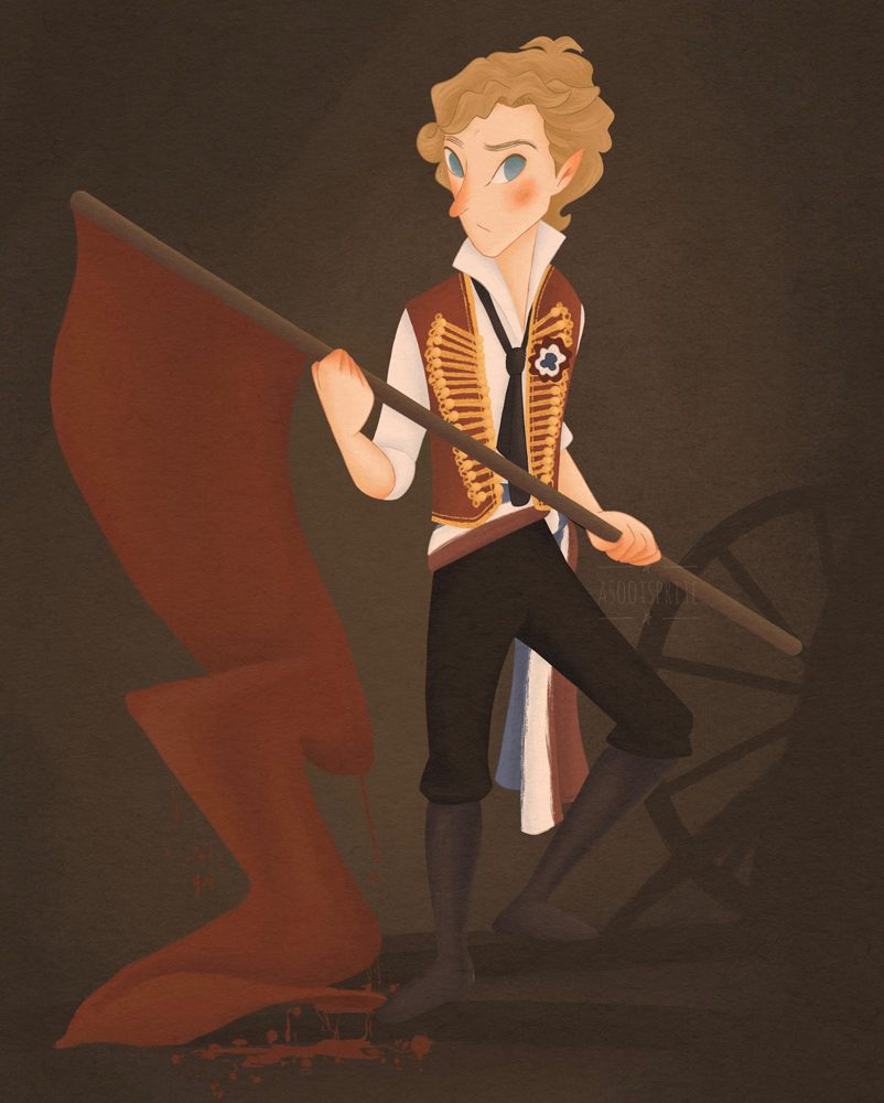
enjolras les miserables victor hugo musicals broadway illustration

Branching out in my musicals, ey? XD Les Mis is one of my original musical obsessions way back and I wanted to show it a little love. I tried to blend Enjolras's stage and movie costumes - I had to do the vest because it's iconic, but I prefer the movie's pants and blond wig.


I have a whole bunch of Oz illustrations too, but I'll add them to their own post!

Friday, January 1, 2021

Godt Nytår

asootsprite illustration raccoon woodland new year
Happy New Year!
Wishing you all the best for 2021
🎉

Sunday, November 8, 2020

The Snow Queen

I've got such a backlog of artwork to share that it's difficult to know which order to even go in! I've written out a list and there's literally 20 things on it that I need to post here, so buckle up I guess as I'll try and post as much of it as I can over the coming weeks.


My recently completed Snow Queen project feels like the most natural place to start, as it's been occupying a large part of my mind for most of the year. Back in June I shared some original sketches that I'd created back in May, and even before then it was a project that I knew was looming for me. 


The Snow Queen by Hans Christian Andersen is probably my all time favourite fairy tale, and it's something I go way back with. When I was in my foundation year of art school for my big final project I decided I wanted to illustrate my own version of The Snow Queen. The artwork is kind of cringey to me now, but it was a labour of love as The Snow Queen is an epic in length for being a fairy tale, and a lot of background research went into everything.


This feels really embarrassing to be sharing, but I also think it's really important to show that we all start somewhere as it's easy to fall into the idea that people can just magically draw like that when in fact it's taken years upon years of practise, hard work, and trial and error. I was definitely bound by the limitations of my skill level (perspective, what's that??) but when I look at all 23 illustrations I can see that I had some good ideas, and it's something I've been wanting to update for a long time. I'm still undecided as to whether or not I'll recreate the whole book as like I said it's a long one, but I'm really proud of these illustrations as they stand right now and am pleased to add them to my portfolio:


The Snow Queen illustration

You can tell that this is supposed to be a direct update of one of the old illustrations above, and I think because of that it really shows just how much I've grown as an artist. One of the biggest things I learnt at art school was the importance of backgrounds in telling the story and setting the scene - I can distinctly remember my tutor looking at my illustration of Baba Yaga and suggesting giving the fir trees a character of their own: "maybe they could look like they're leaning in and listening". And as much as I loathe backgrounds, it undeniably makes a huge difference! I did take Danish architecture into account, although I think there's so little of the buildings on show that it could also be anywhere which isn't necessarily a bad thing. 


I think my biggest struggle with this particular illustration was whether it matched the mood of the others and looked cohesive next to them as the colours are much brighter, but it's also at the very beginning of the story before the Snow Queen tries to ruin Kai's life so I figured it worked in that sense. The Snow Queen is essentially a coming of age story detailing the passage between childhood and adulthood, so I wanted them to look on the cusp of that.


The Snow Queen illustration

I've always loved this section of the tale where Kai is looking out the window at the falling snow, and suddenly the Snow Queen appears and looks at him through the window and beckons. Considering the magic mirror hadn't entered his life yet I've always found this passage a really interesting part of the narrative. This was the very last illustration I created, and it underwent the most changes from sketch to final piece as I'd originally envisioned the Snow Queen smaller, almost like a fairy, as she's described as a snowflake getting brighter and brighter until it formed the shape of a woman. But I didn't like the idea of her shifting sizes as it didn't make much sense, and as her size isn't mentioned in the book I changed it and I like it much better this way. 


The Snow Queen illustration


The mirror falling into Kai's eye and heart while it snows. I intended this to be more of a spot illustration to be surrounded by text.


The Snow Queen illustration

This was the first illustration I digitally painted, and it really set the mood for everything else. It's when the Snow Queen comes to take Kai away and kisses his forehead and touches his heart to freeze him where the shards of mirror are. 


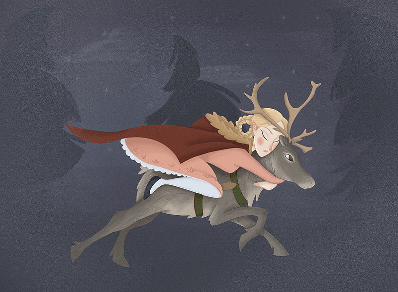
I really wanted to keep some design elements of my original Snow Queen, as well as keeping it as far removed from anything to do with Elsa as possible! The character is always portrayed as a woman so white she's almost albino with equally white hair, and it's an interpretation that's never made much sense to me as I always figured she'd look more indigenous than anything else. But at the same time I didn't want to appropriate Sámi culture or identify it to any particular real world group in any way as she's a magical being and not a person. I tried to make her dress quite fantastical and kept it from following any historical period to keep that other worldly vibe, and as she lives in the mountains I figured she'd make do with the things around her such as a cloak made from the hide of a polar bear, and a crown fashioned from reindeer antlers strung together with brambles. 


Kai's design is the only subtle reference to Frozen as I wanted him to kind of resemble Prince Hans.

The Snow Queen illustration

Again this is another illustration directly based on one of my old ones, except this time I actually used reference for a running reindeer (I think I used a reference for a horse before and it shows!) I kept the red cloak as I love the pop of colour it gives to an otherwise very muted palette. I generally made Gerda very warm toned, and Kai very cool toned which I felt matched their character arcs.


The Snow Queen illustration

I think this one took the most work, but it paid off in the end! The hardest part was getting all of the ice to actually look like ice and not rocks or pieces of slate. I also tried to adjust Kai's skin tone to show how he's slowly freezing. I looked up pictures of frostbite but that was a bit too knarly for what I was going for! I also gave him heterochromia to signify the shard of mirror in one of his eyes.


I tried to create a selection from all different parts of the book, in the hopes that it would tell a condensed version of the story regardless of whether I expand on it. I'd love to create the whole book and self publish it, but at the same time these took so much work that I just need a break from it so I guess we'll see if that ever happens! I created these for my portfolio more than anything, as a self commissioned project to show an example of sequential illustration to any potential clients, but it seems a shame to just shove it in my portfolio and forget about it so I'm hoping to perhaps create some things for my shop out of the designs. Definitely a postcard set, but I'd like to do more with it if possible as it's all of my own original design and I want to move into selling my own characters more. 

Sunday, October 11, 2020

Ohuhu markers

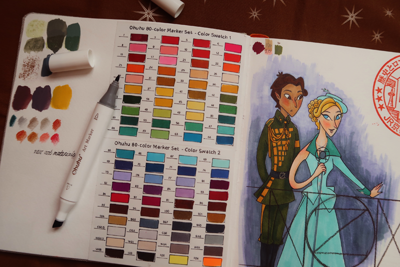
ohuhu markers

I've heard a lot of buzz online about Ohuhu markers, and as alcohol markers are my favourite traditional art medium I've been intrigued for a while. The only brands of markers I've ever used before have been Prismacolor and Copic, but I've been using those brands for about 10 years so I feel like I know what constitutes a good marker! Still, I couldn't justify buying a whole new set just to satisfy my curiosity when I have literally hundreds of Copics and Prismacolor markers at my disposal - or at least I did until I came to Japan.


I've bought a modest collection of Copic markers since being in Japan - they are Japanese afterall, and much cheaper here than they can be bought for in the West. But I'd often still feel limited by my colour palette, so when I saw the Ohuhu markers on offer on Amazon for what translated to £23 for 80, well I couldn't resist!


ohuhu markers ohuhu markers

And so far? I absolutely love these markers. To my mind they're on equal par to the Prismacolor markers - particularly as I got the bullet nib set. I've always found Prismacolor more vibrant and punchy than Copics, and the Ohuhu are the same in that regard. The Ohuhu are also super juicey, and I used them on thick watercolor paper that would dry out my Copics in no time yet these still feel like they have ages left to go.


So if like me you've ever wondered about Ohuhu markers, I wholeheartedly recommend them. They come in a preselected set, which I don't mind as it's a good starting off point. They're not sold singularly so if one does dry out you're a bit stuck, but you could always replace that one marker with a Primsacolor or Winsor & Newton or even a Copic to keep your set. I also like the case the Ohuhus come in - as I'm travelling it's absolutely perfect for me, and it comes with a plastic sheet to stop bleed through and paper swatch sheets to fill out which are welcome additions.


I did a quick drawing of Fiyero and Glinda as they're two characters I draw a lot and are familiar with and I was really pleased with how they came out - it's 100% Ohuhu markers. I think they'll work really well with the Copics I do have here and I'm really excited with how much more option I have now.


ohuhu markers art philosophy watercolor confections decadent pies

Not related to Ohuhu but another art supply I got lately were these watercolors by Art Philosophy. This is another art supply I saw online and got intrigued by, and as I have no watercolors here I decided to go for it.


I love the unusual colour choices they offer, and I went for 'Decadent Pies' as it seemed like a good all rounder. I hate the usual standard watercolor palettes as I find the colours too vibrant for what I like to paint, so I really loved the idea of these but unfortunately I was disappointed when it actually arrived. The colours are nicely pigmented as you can see from the swatches - in that regard they're everything I wanted! But half of them are also metallic, which is not advertised and certainly not what I wanted. You can't tell from the swatch sheet, but basically the whole top row except 'pecan' has micro glitter which is pretty but not very practical and means you can't really mix them. I suppose these palettes are OK if you want to collect all of them, but I don't, and it certainly stops them from being as cheap as they appear. Oh well, not everything can be a winner!


art philosophy watercolor confections decadent pies art philosophy watercolor confections decadent pies

Sunday, September 13, 2020

Planner product research

Oh wow, I didn't realise how long it had been since I updated! Because I'm not uploading everything to Instagram as soon as it's finished for my experiment I keep forgetting to post anything to anywere! So a giant catch up is definitely in order. But in the meantime, some fun research!

Now it's autumn stores are full of 2021 diaries and planners which are one of my favourite things to browse. It's such an exciting time for me, getting to pick which planner I want to stare at for the next 365 days! Which is the most practical, and will fit my needs? It's particularly exciting as I currently live in Japan so it's interesting to me to see how planners differ here.

Because I'm really into the whole planner thing it's always been a dream of mine to one day create my own featuring my illustrations. So I figured as Japan has a lot of cute illustrated planners I'd make the most of being here and buy a few as research so that I've still got them for reference when I eventually have the time and money to invest in creating my own. And I thought I'd share them here, partly because I know this stuff isn't accessible and maybe it'll help others with similar research, partly in the hopes of getting some feedback in what you look for in a planner, and also just to nerd out over planners a little because stationary and art supplies are my favourite thing in the whole world!


These are the three I bought! They're not full planners, these 'schedule planners' seem to be far more popular over here. They're like little exercise books and show each month at more of a glance. For me this isn't detailed enough and I would make more of a full planner with weekly spreads, but these are a nice kind of thing to slip into your bag and take on the go, allowing me to leave my larger planner at home.

Saturday, June 27, 2020

Doubt Comes In


I've really fallen head over heels in love with Hadestown lately. I've been listening to it for a long time, but as I've had renewed interest in Greek mythology and love musical theatre so much it's scratching both itches for me. I wanted to go see it when I was in New York but it had recently won it's slew of Tonys and the only seats left were in the nosebleeds and for ridiculous prices considering they were restricted view so I left it - which right now I'm feeling regretful of, especially with everything shut down as it is!

Originally this was just going to be Orpheus and Eurydice from the myth, but then I figured why try and fight making them look like their musical counterparts and not just go with it? So I did. Reeve Carney kinda looks like my characters anyway so it's perfect! I tried to combine it with the myth, which is why I gave Orpheus an actual lyre and not the guitar he uses in the musical. I took inspiration from this painting by Christian Gottlieb Kratzenstein-Stub, and this painting by Emily Balivet.

My favourite aspect of Hadestown is how it re-characterises these well known figures. Orpheus is quite arrogant in the myth, very sure of himself and his own abilities, and he enters the Underworld with complete certainty that Hades will return Eurydice to him. When he turns back to Eurydice it's with a triumphant air of "I did it!" before he realises that Eurydice isn't in the light yet and so the task is failed. I much prefer the anxious naive Orpheus of the musical, so consumed with self doubt, his journey from optimistically seeing the way the world could be to seeing it the way it is. It makes the tale far more of a tragedy than the original myth for that reason alone because the world beats us all down eventually, as Eurydice knew from the start.


"I'll tell you where the real road lies:
Between your ears, behind your eyes
That is the path to Paradise
Likewise, the road to ruin"

Friday, June 26, 2020

Daedalus and Icarus


I've always really loved Greek mythology. I'm not sure why it's always held such allure to me more so than any other mythology, but it has and as a little girl I carried around an illustrated book of Greek myths everywhere I went in the same way other children carried around security blankets or plush toys. I loved it so much that my mother took me to Ephesus when I was 6 so that it could be brought even more to life for me (I think she was kind of hoping I'd grow up to be a learned historian, but no such luck!). I was obsessed when Disney released Hercules and combined my two biggest interests into one, and as a teen I developed some minor internet popularity for creating a series of illustrations around Disney's Hades and my own design of Persephone that blended the traditional mythology with the Disney universe. Because it was something I began to be recognised for drawing for a long while it became all I drew, and naturally from that I went the other way and completely lost interest. I don't know what's piqued it again recently, but I'm back and I can't get enough!

I didn't really think about this too much as I was painting it, I just had an image in mind that I wanted of Daedalus reaching for his son Icarus and just went for it. First page of a brand new sketchbook and I approached it without a second thought, a bravery I'll likely never see again! I messed up in that I forgot to make Daedalus look older than Icarus, and by the point I realised it was too far in and if I'd given him white or grey hair it would've thrown off the whole palette and distracted from his wings, so I just gave him some grey temples and hoped for the best. Hopefully the myth is obvious enough to get away with it!

I coloured the sun with a gold sharpie, and I love the contrast it gives the piece. The rest is gouache, touched up with a little coloured pencil for the outlining and such. I'm enjoying painting a lot lately. I turned to digital as I didn't feel like I could get the results I wanted from traditional mediums with a cohesive colour palette, but I feel like painting digitally has taught me how to paint traditionally too.

Thursday, June 25, 2020

Sister Alyonushka, Brother Ivanushka


Another Russian folktale, this one based on Sister Alyonushka, Brother Ivanushka. You can read the whole tale here. As in a lot of these stories they were orphaned as children and set out across the forest so Alyonushka could find work. Her younger brother Ivanushka soon grows thirsty on the long journey and begs for water each time he sees it, but each time Alyonushka says no and warns that he'll be transformed into various animals. Finally he's so thirsty that he doesn't stop to ask at the next spring, and Alyonushka is devastated to see him transform into a goat. There's much more to the tale, and you'll be glad to know that it works out happily - Ivanushka is able to save his sisters life and gets transformed back into a boy.

It definitely has elements of that scene in Pinocchio. I feel inclined to say that Ivanushka was less deserving of the punishing transformation as literally all he wanted was a glass of water, whereas Lampwick and co got up to all kinds of shenanigans - but really no one ever deserved that.

Anyway, when I was deciding to draw The Armless Maiden I initially couldn't decide which folktale to illustrate so I decided to go with both. I've never drawn a goat before, but I think it came out OK? I tried to include elements to hint that all isn't what it seems by giving him the same coloured fur and eyes and Alyonushka.

Wednesday, June 24, 2020

Inside my sketchbook

Like I said in my last post, I've been drawing a lot in my sketchbook lately and thought I'd offer a peek at what I've been working on. Not all of it's finalised, much of it is simple sketches that are waiting to be digitally coloured, but I always enjoy 'behind the scenes' glimpses so figured I'd offer one!


Y'all know how I love to draw a ballpoint portrait of Aaron Tveit 😅 I found this photo saved on my iPad when I was clearing it out and realised that I'd meant to draw it way back. I actually find drawing portraits a good way to unwind, and I like to stay on top if my skills. In the past I've either focused exclusively on realism or exclusively on illustration and then gotten frustrated when I've lost skills in the other.

I am often asked if I'll do portrait commissions, and I'm afraid the answer will always be no. It's something I do for fun and it's difficult for me to put my heart into it when I don't care about who I'm drawing, which is why I draw the same people over and over. It's also why I stopped sharing my portraits for a long time as I didn't want to create a business of it and get stuck drawing strangers.


Dmitri and Anya from Anastasia, they'll be coloured digitally at some point. I wanted them to be similar in style to my Wicked illustrations, with the background elements specific to each character. Dmitri is in St Petersburg, and supposed to look like he's casually playing with the music box by throwing it from hand to hand - I was really stumped with how to pose him, and this was the first character illustration I'd done like this in a long while so I felt like I was getting back into it. Anya came much easier, and it shows in her more natural posing and flow. Pooka is perhaps too small, but eh. There's the sign in the background where she meets her crossroad - one pointing to St Petersburg, one to the Fishermans Market where she's been given a job out of the orphanage. It's a pivotal moment for her, so it felt like the perfect backdrop. I just changed the writing to Cyrillic because that's the one thing that bothers me about the movie - in all of the Russian locations, all of the background writing is in English and I think it's details like that that can really solidify a setting - or not in this case. Especially as I watch the film with Russian audio so it's even more jarring!


I got some new Copic markers and wanted to try them out, so I sketched this based on a publicity photo of the London production of Wicked. I love this scene in the musical because it's so short but so telling of how the distance between Glinda and Fiyero is growing.


Another sketch to be coloured digitally. I've always liked the movie The Little Mermaid but it's never been my favourite, but it's really growing on me lately. I'm at a point in my life that I can relate to Ariel more, and that feeling of being stuck and yearning for change and the freedom to be who you want to be. Which isn't a million miles from why I relate so strongly to Elsa, who is my favourite, and they're both obviously Hans Christian Andersen characters so I thought I'd create a little homage to that.


Hans looking suitably pissy which is my favourite way of drawing him, and I tried to add some little historical details to his outfit as I've fallen down a rabbit hole of watching historical costumers on YouTube and those videos showing what the princesses would look like historically accurate. No one ever does the princes or focuses on male historical fashion which is a shame I think, I'm almost tempted to try and perhaps create a little series of them myself. And a ballpoint portrait of Mika, my other fave who I draw all of the time! I want to try and translate him to my illustrative style some time and see how it works, as he is very distinctive so wouldn't be that difficult.


I don't know if I've mentioned about it on this blog before, but when I was doing my foundation degree I created a whole illustrated book of the original tale of The Snow Queen. I found the original book I'd created when I was clearing through stuff to move and it felt a bit cringey to me now as my skills have developed so I decided to update it. I'll go into it all in more detail when I've finalised and digitally coloured some of them, but these are some of the rough sketches I'm working with right now. I'm super excited for how they're coming out! I obviously don't want it to reference Frozen as it's such a different story even if it is what inspired it, but as I'm such a fan of Frozen I have thrown in little 'easter eggs' here and there, such as basing elements of Kai on my design of Hans - I made a big post on my personal blog about how I feel Hans is an interpretation of Kai anyway, so it fit. It won't be too obvious where you think "OK that's Hans", but enough to link the two when you think about it.


I've been drawing so much that I had to buy a new sketchbook! I've nearly finished my Leuchtturm, which is a shame as they're my brand of choice and not easily available here. I picked up a Handbook Travelogue Journal which I've been intrigued about for a while, and got the watercolour edition as I'm really enjoying painting lately. I've already begun, but you'll see more of that soon!
© a soot sprite. Design by FCD.